
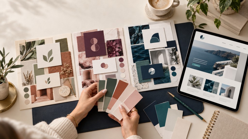
Your favorite color might be purple, but does that mean your entire website should be purple? Can a bold, colorful personality work for a business that needs to communicate calm and trust?
Choosing brand colors means finding a balance between personal expression and clear communication. You want your business to feel like you while helping the right customers feel comfortable, interested, and ready to learn more.
The best place to start is with the impression you want your business to make.
Start With Your Personality—and Your Purpose
When you run a small business, your personality often shapes the customer experience. Your colors can help communicate that character.
Before choosing a palette, ask yourself:
- What three words describe my business?
- How do I want customers to feel when they interact with me?
- What kind of experience do I actually deliver?
- Who am I trying to reach?
Perhaps your business is warm, creative, and approachable. Or maybe it is focused, practical, and professional. Those qualities give you a more useful starting point than choosing colors simply because they look attractive together.
For example, an expressive business owner can bring personality to a professional consulting brand through a bright accent color while keeping the main palette restrained and easy to read.
Consider What Your Customers Need to See
Your branding should reflect your personality, but customers also need to recognize that your business is relevant to them.
A person looking for a playful gift shop may respond to a different presentation than someone comparing bookkeeping services. Neither business needs to follow a rigid color formula. Each needs a visual identity that supports its offer.
Think about your customers’ situation:
Are they looking for reassurance? A clear, balanced design may help them feel more comfortable exploring your services.
Are they looking for creativity? An unexpected color combination can support an original, expressive identity.
Are they shopping for a premium experience? A restrained palette, thoughtful spacing, and consistent presentation can help communicate care and attention.
Color works alongside your words, images, layout, and reputation. It cannot communicate your entire message by itself.
Use Color Associations as Inspiration
You may have heard that blue means trust, green means growth, and red means excitement. These are familiar design associations, but they are not universal rules.
The impression a color creates depends on its shade, surrounding colors, cultural context, and how it is used. A soft pink and a vivid hot pink can create very different moods.
Use these examples as creative starting points:
| Color family | Possible visual direction | Ways to adjust the personality |
|---|---|---|
| Blue | Composed, dependable, clear | Navy feels more reserved; brighter blue adds energy |
| Green | Natural, grounded, fresh | Olive creates an earthy look; emerald adds richness |
| Teal | Balanced, fresh, contemporary | Muted teal feels gentler; saturated teal feels more expressive |
| Purple | Imaginative, distinctive, reflective | Lavender feels softer; deep plum creates a richer mood |
| Red and orange | Bold, lively, warm | Terracotta feels earthy; vivid shades create stronger emphasis |
| Yellow | Bright, welcoming, optimistic | Muted gold feels warmer; strong yellow adds a playful note |
| Pink | Gentle, expressive, playful | Dusty rose feels subdued; bright pink feels energetic |
| Neutrals | Simple, versatile, understated | Warm neutrals feel softer; cool neutrals create a crisper look |
Choose colors because they support your specific business—not because a chart promises they will make customers buy.
Give Each Color a Job
A useful palette needs structure. If every color competes for attention, customers may struggle to see what matters.
Start with a few roles:
- Primary color: The main color people associate with your business.
- Supporting color: Adds variety and complements the primary color.
- Accent color: Draws attention to selected details or important actions.
- Neutral colors: Support backgrounds, text, and readable layouts.
You do not need a different color for every role. A small, well-planned palette can give you plenty of flexibility.
For Emerge WebWorx, navy and teal provide a foundation for a polished, contemporary identity. Light backgrounds create breathing room, while carefully placed teal details add personality and emphasis.
Let Your Favorite Color Play the Right Role
You do not have to abandon a favorite color because it feels too bold, unusual, or difficult to use.
Instead, adjust how you use it.
If you love bright orange, it might work beautifully in selected graphics or highlights while a quieter color handles larger areas. If you love purple, a muted plum may suit your business better than an electric violet.
You can change:
- Shade: A lighter or darker version can create a different impression.
- Intensity: A muted color can feel gentler than a highly saturated one.
- Amount: A small accent has a different effect from a full-page background.
- Pairing: Surrounding colors can make the same shade feel playful, earthy, or formal.
This gives your personality room to show while keeping your brand practical.
Make Readability Part of the Design
A beautiful palette needs to work for the people using your website.